Graphic Design for Nonprofits
Tell your story with great design that gets results
When you hire Five Maples’ nonprofit graphic design services for direct response fundraising, we don your donors’ reading glasses and read your piece the way they would. This allows us to create your fundraising material based on what donors respond to and, subsequently, help you bring in more donations.
By hiring our design, print and mail services for your projects, you will not only improve your results, but you will save yourself a lot of time and hassle. Our design professionals are skilled in producing high quality and mission driven fundraising pieces.
Our approach to nonprofit graphic design is simple:
Be donor-centric.
Keep it on brand.
Make it easy to read.
Make it interesting.
Make it fun!
While we do not want to distract from the call-to-action and messaging, we do want to make your fundraising appeal interesting to look at. The team at Five Maples knows how to keep your design on brand while raising more money! Our designs balance fundraising best practices with your organization’s color palettes, typography, and brand guidelines. We use the most up-to-date design tools like Adobe InDesign, Adobe Illustrator, and Adobe Photoshop.
Large Type Matters when Raising Money
We recently ran a large A/B test on point size. A list of 29,219 donors was split into two random, balanced test panels. Each received the same annual fund appeal letter. The only difference between letter A and B was point size. Letter A with 11.5-point text ran to two pages; Letter B with 14-point text ran to three pages. Donors responded to the letter with larger text at a 19% higher rate and with an 8% higher average gift. Letter B raised 29% more dollars.

Thanks again for a fabulous job, it’s always such a treat for us to see you weave your magic and design pieces for us that are eye-catching, uplifting and represent Dakin and our work so beautifully.
— Lee Chambers, Dakin Humane Society
Our Design Principles
Here are some of the principles we keep in mind when designing digital and printed materials for fundraising and stewardship:
-
Donors give because another person asked them. And donors give when they empathize with people and their stories. We know how to present these stories to ensure they spark an emotional interest in potential donors.
-
The photos you use should relate directly to the story you are telling, whether they appear in a letter or annual report – they aren’t there just for color.
We have found the best photos are those showing one or two people looking directly into the camera. People who need my help. People I want to help. People who are grateful for my help. People or organizations who will do good things with my help; like support the animals, the forest or the caregivers that make my world better.
-
Stewardship pieces deserve top-quality design, we want the donor to see and read. Readers are scanners. Their eyes grab on to headlines, captions, bolding, underlining, one-line sentences, call-outs, testimonials, drop-quotes and postscripts.
Our top graphical design services work with typography that reaches deep into the reader’s heart with both art and words.
-
Did you know that annual appeal letters raise more than brochures or self-mailers? We’ve seen this time after time. Hence, we take the time to make letters look like love letters or an old-fashioned, lovely card to your donors.
We know they will ALWAYS make an impact – unlike appeals that are designed to look like marketing pieces, which are guaranteed to raise less money. Why? Because they don’t speak to the heart.
-
Most donors love to read. But, unlike most designers, they are mostly past retirement age. We believe easy-to-read text is essential.
We use large point-size text and lots of inter-line spacing in our designs. We are also sure to avoid grayscale text and white or colored body text over other colors or graphics.
-
While facts and numbers are necessary to relay certain information efficiently, they don’t speak to the reader’s emotions.
With the use of design elements such as infographics and icons, we ensure to make numbers more accessible and fun, therefore improving the donor’s reading experience.

Five Maples provided great support when doing the graphic design for our annual appeal layout. Everyone loved the fresh new look and it yielded record results.
— Francis MacAllister, Director Of Development, Chill Foundation
Design Examples
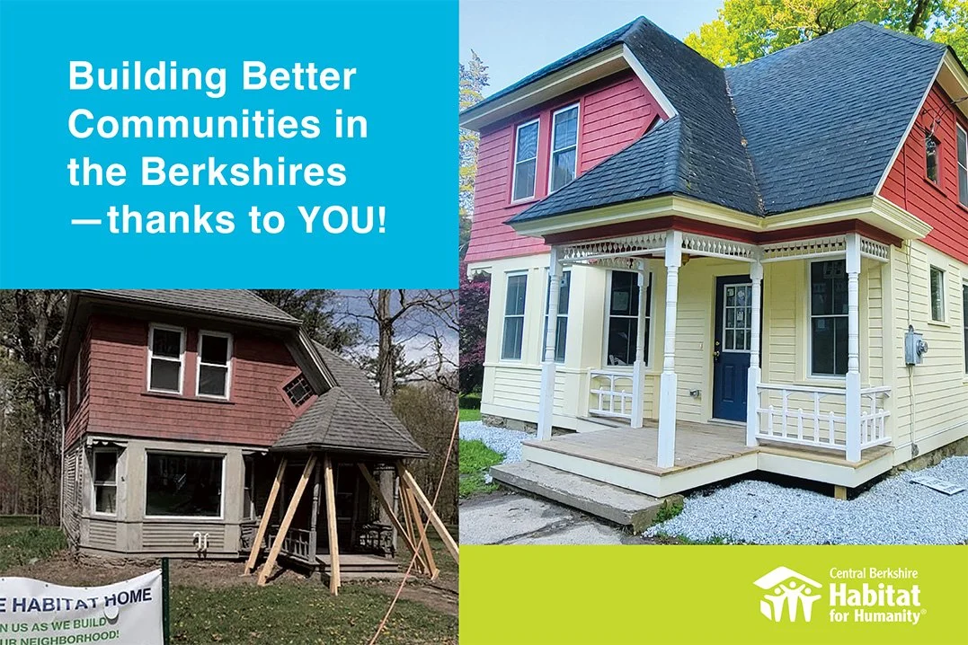
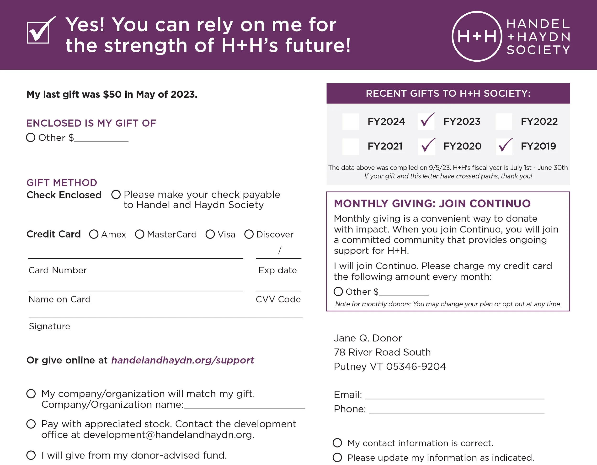
For best practice design for nonprofit communications, based on analysis of results from many campaigns, check out these examples.

Five Maples offers honest, straight-forward service. Thanks to their team, Norwich has increased donor engagement and direct mail response rate. Five Maples is committed to producing the best product within our budget.
— Reed Curry, Director of Class Giving, Norwich University
The team at Five Maples helps you think about the full package
What size envelope should I use? Using a #10 envelope usually suffices for appeals, however, think about the audience and time of year. Are these major donors? Is it a holiday? Consider using an A7 envelope to set it apart.
Should the outer envelope include a tagline?
What size donation form should you use? And what information should be included?
In addition to fundraising appeals, postcards, and donor impact reports, our designers are also skilled in nonprofit digital designs like social media posts, retargeting ads, and emails.

Since receiving the box of letters, I have been so busy that I have failed to let you know how fantastic the total package looks. To add to the look of the package was the ease of writing notes without even having to take the letter completely out of the envelope. With so many to write that small detail was a huge boon.
I can't thank you enough for being my partner in the process. You were supportive, efficient and generous with your suggestions.
— Laurie Danforth, President, The Nature Museum
GET IN TOUCH
We help nonprofit organizations save time, raise more money, and enjoy doing it. Get Five Maples on your team and start raising more money today.

Terrific job! Hats off for a great design.
— Thomas Thompson, Development Operations Associate,
Maine Seacoast Mission


